Card Details
Clicking on any card in the inventory opens the detail view where you can view and edit all information about the component.
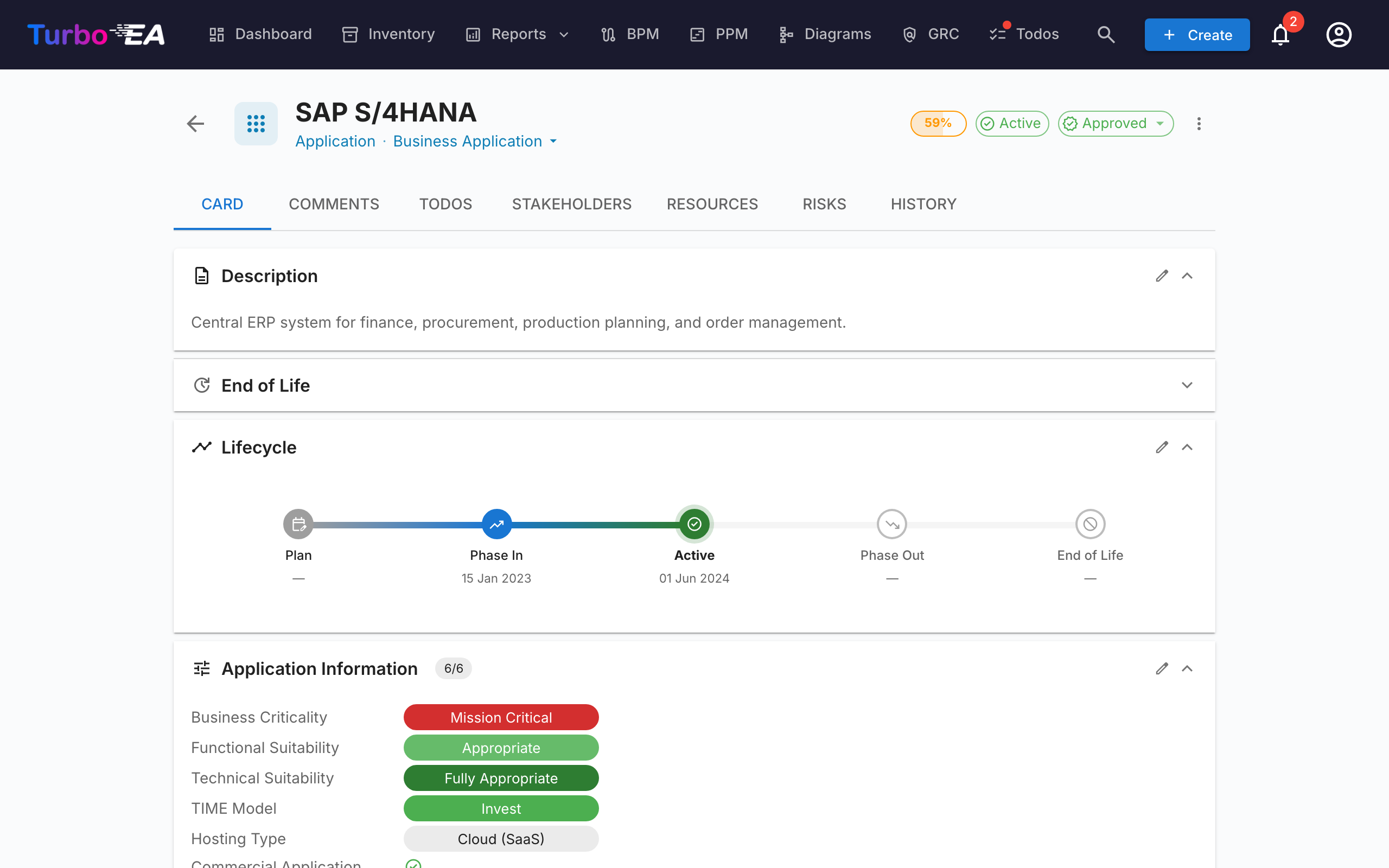
Card Header
The top of the card shows:
- Type icon and label — Color-coded card type indicator
- Card name — Editable inline
- Alias — The card's other name, shown under the title when set. Click the title's edit pencil to change the name and the alias together. Aliases are matched by every search box, so a card can be found by the name your organisation actually uses for it.
- Subtype — Secondary classification (if applicable)
- Approval status badge — Draft, Approved, Broken, or Rejected
- AI suggest button — Click to generate a description with AI (visible when AI is enabled for this card type and the user has edit permission)
- Data quality ring — Visual indicator of information completeness (0–100%)
- Actions menu — Archive, delete, and approval actions. Also includes a one-click Observe this card toggle (when the card type defines an Observer role) so any user with view access can follow the card without going through the Stakeholders tab.
Custom Logo
Cards of a type that allows it can carry their own logo instead of the generic type icon — so an Application for SAP, Kafka or Jira shows that product's own mark. Recognisable logos make an inventory much faster to scan, especially for people who are reading it rather than maintaining it.
Hover the icon at the top-left of the card and click it to upload, replace or remove the image. The type icon does not disappear: it moves to a small badge on the corner of the logo, so you can still tell at a glance what kind of card you are looking at.
- Accepted formats — PNG, JPEG, WebP or GIF, up to 1 MB. SVG is not accepted, because it can carry scripts.
- Where it shows — the card header, the optional Logo column in the Inventory, and any published web portal built on that card type.
- When there is no logo — the card falls back to its type icon, exactly as before.
Logos are available on card types where an administrator has switched them on; out of the box that is Application and IT Component. See Meta Model.
Click the logo and choose Choose a brand icon… to pick from a built-in pack of several thousand brand marks — search for the product by name and select it; no image file is needed. Upload takes your own file instead. An AI assistant connected over MCP can set logos the same way in bulk, and where a product is not in the pack it will fetch the mark itself and upload it.
The same menu is available from the Logo column in the Inventory — hover a logo cell and click — so marks can be put on a freshly imported landscape without opening every card. It is one card at a time on purpose: a logo is not offered to fill-down or Mass Edit.
Approval Workflow
Cards can go through an approval cycle:
| Status | Meaning |
|---|---|
| Draft | Default state, not yet reviewed |
| Approved | Reviewed and accepted by a responsible party |
| Broken | Was approved, but has been edited since — needs re-review |
| Rejected | Reviewed and rejected, needs corrections |
When an approved card is edited, its status automatically changes to Broken to indicate it needs re-review. Archiving a card's parent has the same effect on any approved children it moves in the hierarchy. Everyone with a stakeholder role on the card is notified — except whoever made the change — and the flip is recorded on the card's History tab. One action that breaks several cards, such as a mass edit, sends each person a single summary rather than one notification per card.
Detail Tab (Main)
The detail tab is organized into sections that can be reordered and configured by an administrator per card type (see Card Layout Editor).
Description Section
- Description — Rich text description of the component. Supports the AI suggestion feature for automatic generation
- Additional description fields — An administrator can file any of a card type's own fields under Description, so this section may carry extra fields beyond the description itself
- Links — A web address (
http://orhttps://) typed into the description, any text field, a comment or a to-do becomes a link that opens in a new tab
Lifecycle Section
The lifecycle model tracks a component through five phases:
| Phase | Description |
|---|---|
| Plan | Under consideration, not yet started |
| Phase In | Being implemented or deployed |
| Active | Currently operational |
| Phase Out | Being decommissioned |
| End of Life | No longer in use or supported |
Each phase has a date picker so you can record when the component entered or will enter that phase. A visual timeline bar shows the component's position in its lifecycle.
If a phase is dated after a phase that should follow it — for example Phase Out after End of Life — a warning icon appears next to that date, and the same warning shows under the field while editing. It is only a hint: the dates can still be saved as entered.
Custom Attribute Sections
Depending on the card type, you will see additional sections with custom fields configured in the metamodel. Field types include:
- Text — Free text input
- Multi-line Text — Free text input that preserves line breaks, rendered as an auto-growing text area
- Number — Numeric value
- Cost — Numeric value displayed with the platform's configured currency
- Boolean — Chosen from a Yes / No list, with None to clear it; shown as a green Yes or blue No pill, — when unset
- Date — Date picker
- URL — Clickable link (validated for http/https/mailto)
- Single select — Dropdown with predefined options
- Multiple select — Multi-selection with chip display
Fields marked as calculated show a badge and cannot be edited manually — their values are computed by admin-defined formulas.
Hierarchy Section
For card types that support hierarchy (e.g., Organization, Business Capability, Application):
- Parent — The card's parent in the hierarchy (click to navigate)
- Children — List of child cards (click any to navigate)
- Group by subtype — When a card has many children of different subtypes (for example business units, regions and teams under one company), they are automatically grouped into collapsible subtype sections, each with a count, with a trailing No subtype section for unclassified children. Use the group/list toggle next to the Children count to switch between the grouped and flat views.
- Hierarchy breadcrumb — Shows the full path from root to current card
- Link type — When an administrator has configured link types for this card type, each parent-child link can be labelled — for example one subsidiary that is commercial and another that is sales. The label sits on the child, so the parent's card shows a label beside every child and the child's card shows its own beside its parent. Removing or moving a card to the top level clears its label, and the change is recorded on the History tab.
Relations Section
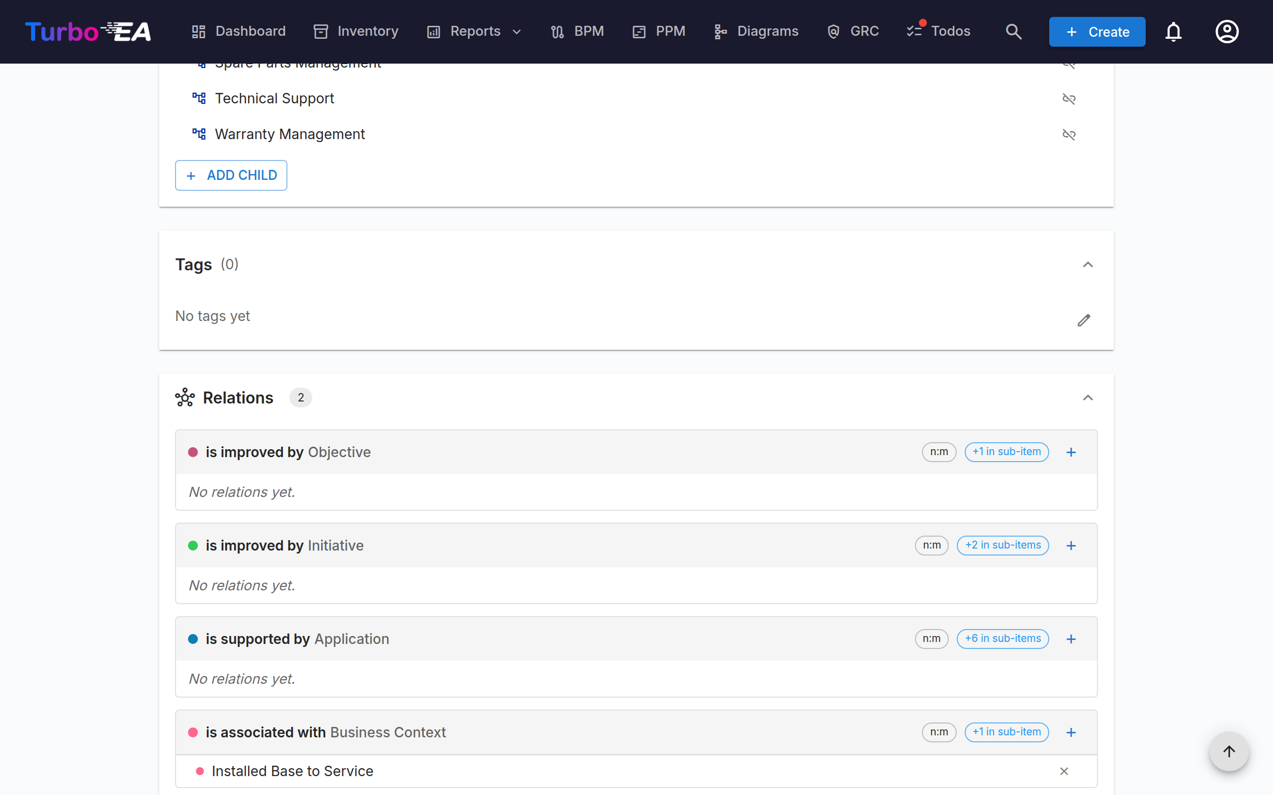
Shows all connections to other cards, grouped by relation type. For each relation:
- Related card name — Click to navigate to the related card
- Relation type — The nature of the connection (e.g., "uses", "runs on", "depends on")
- Add relation — Click + to open the add dialog for that relation. It lists matching cards as you type (best matches first, more load as you scroll) and hides the ones already linked, with a caption showing how many. Clicking a card links it straight away and it appears as a chip at the top — click a chip's × to undo that one. The dialog stays open so you can add as many as you like, and on a phone it opens full-screen. Relations that have no section of their own are reached from the Add Relation button at the bottom of the section. When the linked type is hierarchical — Business Capability, Organization and the like — the dialog shows it as an indented tree instead of an alphabetical list, so you can pick a sub-capability by its branch. Searching keeps a match's parents visible for context, and cards you can't pick (already linked, just added, or this card itself) stay in place greyed out so the levels around them still read correctly.
- Ordering — Related cards are listed alphabetically by name
- Remove relation — Click the delete icon to remove a relation
- Group by subtype — When a relation section has many related cards, they are automatically grouped into collapsible subtype buckets (each with a count), with a trailing No subtype bucket for unclassified cards. Use the group/list toggle in the section header to switch between the grouped and flat views.
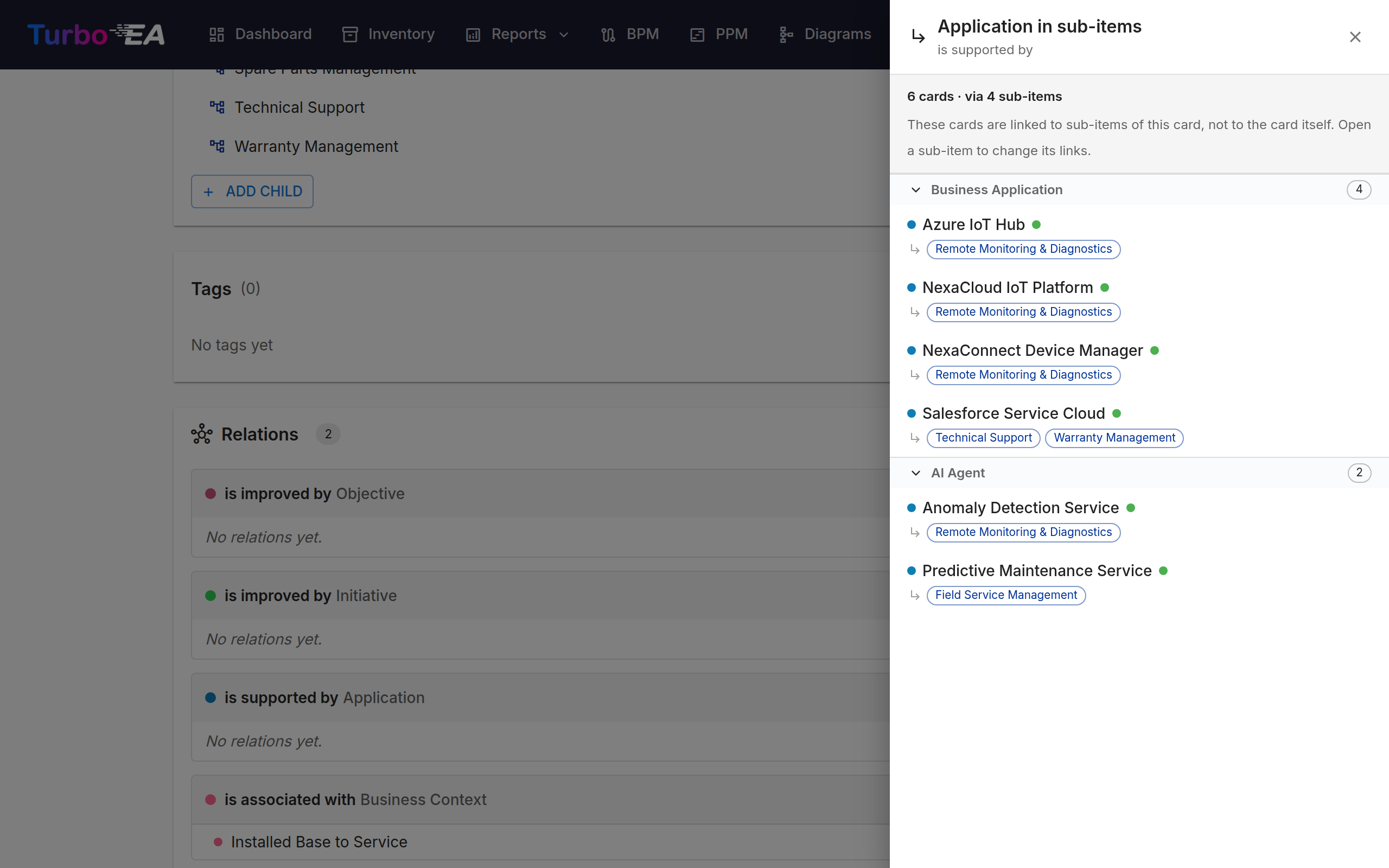
- Cards linked to sub-items — When a card has sub-items, each relation group shows a +N in sub-items chip counting the cards linked further down the hierarchy — for example, the applications attached to a capability's sub-capabilities. Click it to open a read-only list where each row names the sub-item holding the link (a card reached through several sub-items appears once, with each one listed). The count only includes cards that are not already listed in the group above it. To change a link, open the sub-item that owns it. The list is grouped into collapsible subtype sections, so the subtype is named once per section instead of on every row. Within a section, cards whose lifecycle phase needs attention come first (end of life, then phasing out), and each card's phase is shown as a coloured dot next to its name — hover it for the phase name.
Dependencies Section
A Layered Dependency View of the card and everything one hop away, grouped into the four architecture layers. Shift-click a card to re-centre on it and walk the landscape without leaving the page.
The open in new tab icon in the view's toolbar opens the full Dependencies report in a new tab, centred on whatever the view is centred on at that moment — so a card you navigated to, not necessarily the one you started from. Use it when you need what the report adds around the same picture: time travel, the transition marks, the table view, and saving the view as a report.
Tags Section
Apply tags from the configured tag groups. Depending on the group mode, you can select one tag (single select) or multiple tags (multi select).
Resources Tab
The Resources tab consolidates all supporting materials for a card:
- File Attachments — Upload and manage files (documents, spreadsheets, presentations, OpenDocument and legacy Office files, images, archives, Outlook and e-mail messages, CSV, Markdown, JSON and XML — up to 20 MB). When uploading, select a document category from: Architecture, Security, Compliance, Operations, Meeting Notes, Design, or Other. The category appears as a chip next to each file. Use the replace icon next to a file to upload a new version in its place — the entry is then dated and attributed as a fresh upload, and the previous version remains only in the card's History tab — and the pencil icon to rename it or change its category; the extension must stay the same.
- Document Links — URL-based document references. When adding a link, select a link type from: Documentation, Security, Compliance, Architecture, Operations, Support, or Other. The link type appears as a chip next to each link, and the icon changes based on the selected type. Use the pencil icon next to a link to change its name, URL or link type; the URL must start with
http://,https://ormailto:, and every change is recorded in the card's History tab. - Diagrams — Link existing diagrams to this card. Linked diagrams appear as thumbnail previews that you can click to open in the diagram editor. Use the Link Diagram button to search for and attach an existing diagram, or click the unlink icon to remove the association.
EOL Section
If the card is linked to an endoflife.date product (via EOL Administration):
- Product name and version
- Support status — Color-coded: Supported, Approaching EOL, End of Life
- Key dates — Release date, active support end, security support end, EOL date
Comments Tab
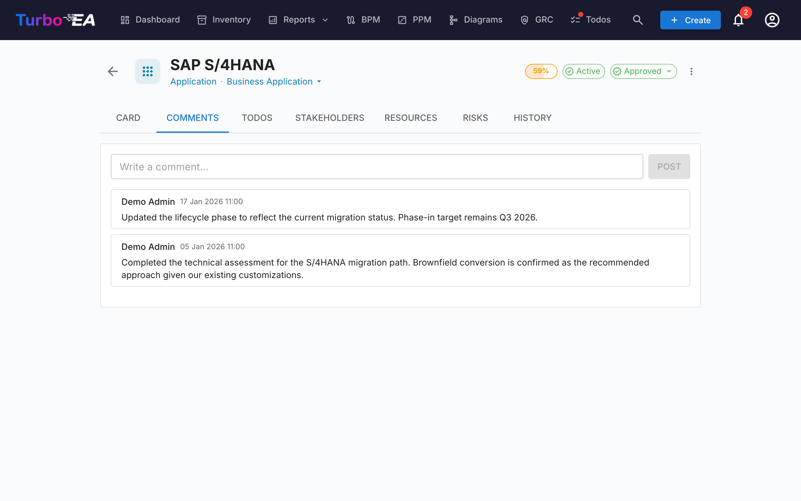
- Add comments — Leave notes, questions, or decisions about the component
- Threaded replies — Reply to specific comments to create conversation threads
- Timestamps — See when each comment was posted and by whom
- Links — A web address in a comment is clickable and opens in a new tab
Todos Tab
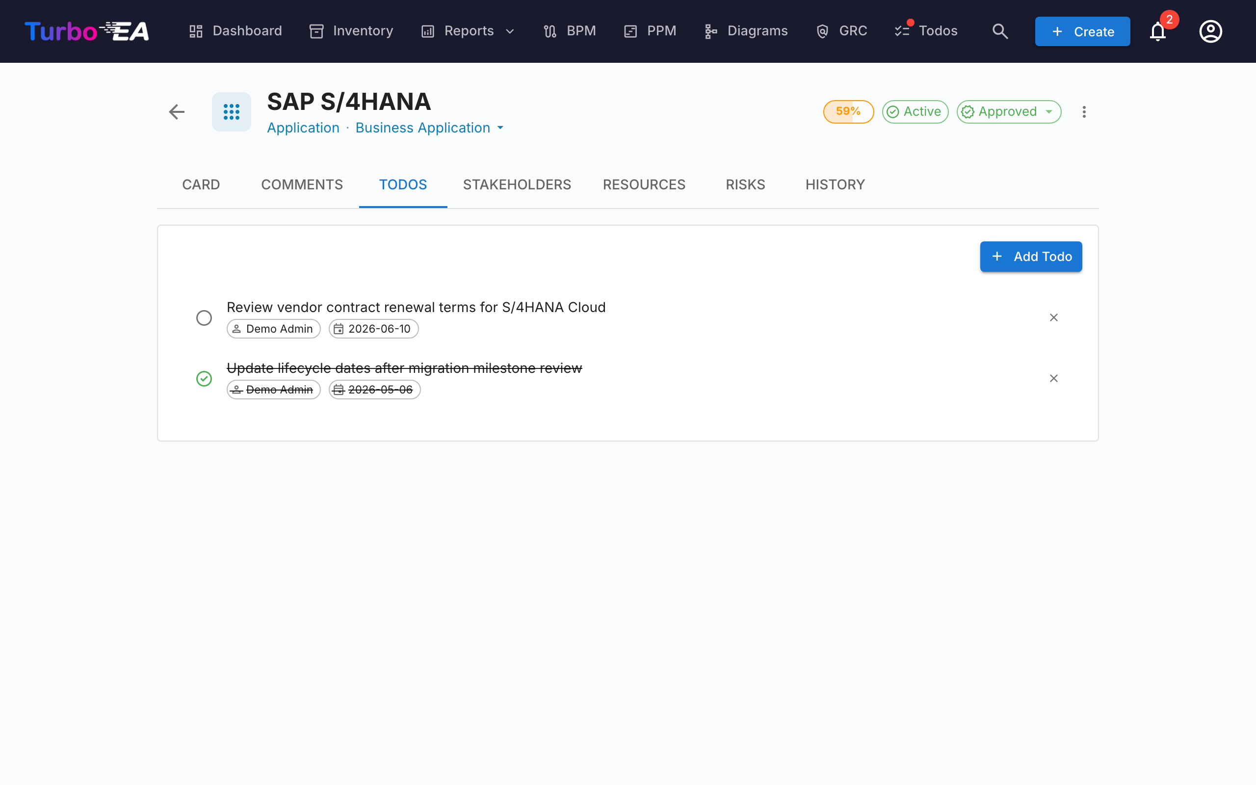
- Create todos — Add tasks linked to this specific card
- Assign — Set a responsible person for each task
- Due date — Set deadlines
- Status — Toggle between Open and Done
- Recurring — Switch on Repeats to make a todo repeat on a schedule (every N days, weeks, months, or years); completing it automatically creates the next occurrence
Stakeholders Tab
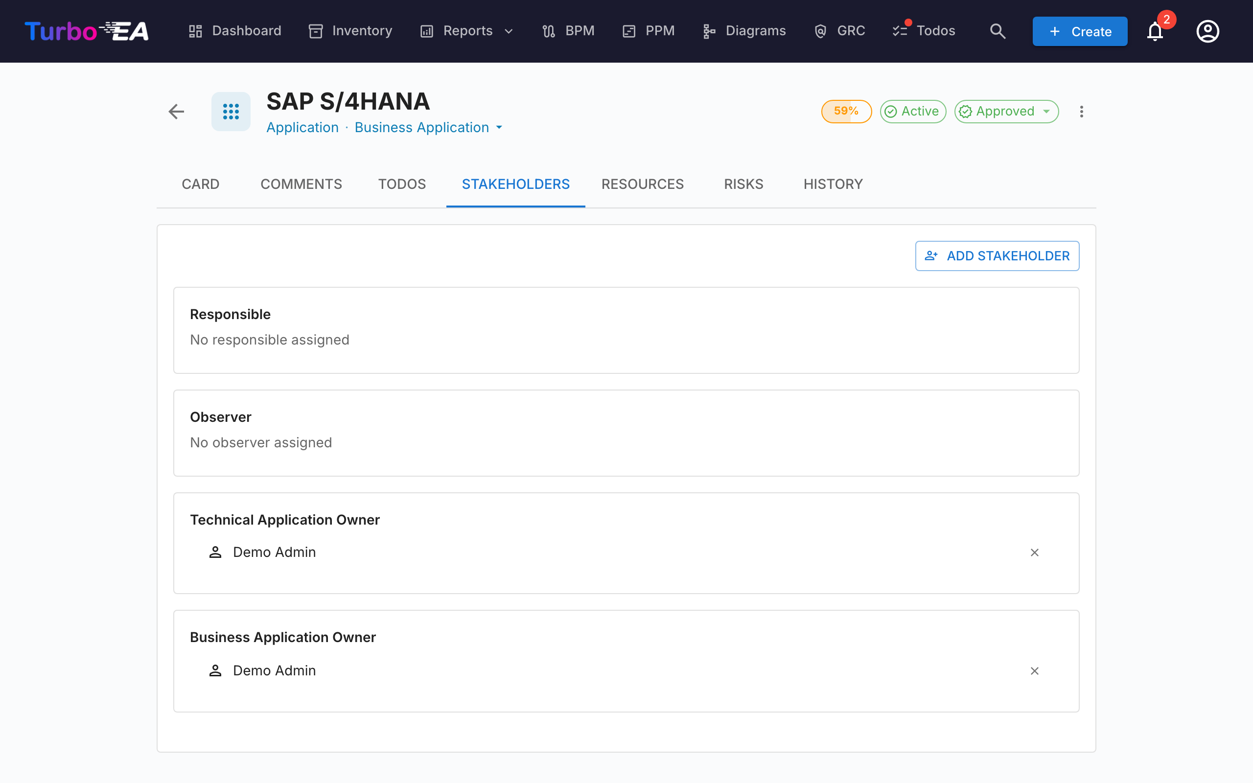
Stakeholders are people with a specific role on this card. The available roles depend on the card type (configured in the metamodel). Common roles include:
- Application Owner — Responsible for business decisions
- Technical Owner — Responsible for technical decisions
- Custom roles — Additional roles as defined by your administrator
Stakeholder assignments affect permissions: a user's effective permissions on a card are the combination of their app-level role and any stakeholder roles they hold on that card.
Where a role has a colour set in the metamodel, its group is marked with it, so you can pick out an owner from an observer at a glance.
Searching and inviting
Pick a stakeholder via the searchable autocomplete — start typing and the dropdown filters on both name and email (email appears as the secondary line so two users with the same name can be told apart at a glance).
If the email you type doesn't match an existing user, an "Invite «email» as a new user" option appears at the end of the dropdown. Selecting it expands an inline mini-form right inside the picker — pick a role (Member or Viewer by default), optionally edit the display name, and submit. The new user is invited via the standard invitation email and assigned the chosen stakeholder role on the card in a single action, so you never have to leave the card to onboard a contributor.
The invite path requires the users.invite permission, a delegated form of admin.users that admins can grant to trusted members. A privilege-escalation guard prevents non-admins from inviting users into admin roles — the role dropdown silently filters to roles the inviter is allowed to delegate.
History Tab
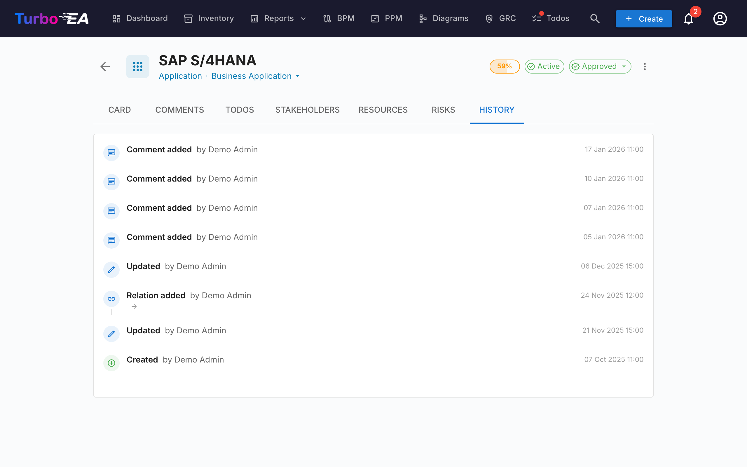
Shows the complete audit trail of changes made to the card: who made the change, when it was made, and what was modified (previous value vs. new value). This enables full traceability of all modifications over time.
Everything that moves the card's Modified date appears here — an edit by hand, a spreadsheet import, a platform migration or ServiceNow sync, a tag change, a bulk edit, or a hierarchy move that pulled this card along. System housekeeping changes neither: recalculating data-quality scores, re-running calculated fields, and backfilling hierarchy levels or card IDs leave both the history and the Modified date alone.
ADRs Tab
Every card carries an ADRs tab listing the Architecture Decision Records linked to it, showing each decision's reference, title, status, all of its linked cards, and when it was last modified. Click a row to open the decision.
If you are allowed to manage ADR links, the tab also offers Link ADR to attach an existing decision and Create ADR to start a new one that is pre-linked to this card, plus an unlink action on every row. On cards with no linked decisions the tab is hidden unless you hold that permission, so read-only users never see an empty tab.
Risks Tab (GRC enabled, when present)
When the GRC module is enabled and the card has at least one linked risk, a Risks tab appears listing every risk linked to the card with a one-click path back to the Risk Register. The tab is auto-hidden when no risk is linked, so cards with no GRC activity don't carry an empty tab.
Compliance Tab (GRC enabled, when present)
When the GRC module is enabled and the card has at least one linked compliance finding, a Compliance tab appears listing every finding currently linked to the card. The same Acknowledge / Accept / Create risk / Open risk actions as the GRC Compliance grid are available so the card owner can triage their own findings without leaving the card. Auto-hidden when no finding is linked.
Process Flow Tab (Business Process cards only)
For Business Process cards, an additional Process Flow tab appears with an embedded BPMN diagram viewer/editor. See BPM for details on process flow management.
PPM Tab (Initiative cards only)
When the PPM module is enabled, Initiative cards display an additional PPM tab as the last tab. Clicking this tab navigates to the PPM Initiative Detail View where you can manage status reports, budgets, risks, tasks, and Gantt timelines.
Archiving
Cards can be archived (soft-deleted) via the actions menu. Archived cards:
- Are hidden from the default inventory view (visible only with the "Show archived" filter)
- Are automatically permanently deleted after 30 days
- Can be restored before the 30-day window expires